Pandemic Statistics for Dummies
Two really simple principles that go a long way to de-sensationalize the news.
I joke with people that early on in the pandemic, there were two things I swore I absolutely would not make: my own Covid models, and sourdough bread. I’ve successfully held to both of those (I did make a lot of this “peasant bread,” which is super easy and very tasty), to this point.
While I haven’t gotten into the game myself, for a good while I was obsessively checking other people’s Covid tracking stats. I was particularly fond of “The Lawyer Craig” on Twitter, who alas has stopped doing daily reports (you can see the last thread here). His best contribution, though, might be the Graph of Science that I’ll reproduce here:
(He made this to illustrate the effect of a holiday on the 7-day rolling averages that people tend to use for tracking stats, and also how people overreact to them. A few days of decreased reporting leads to an apparent drop in the number of cases that lasts about a week, then an artificial peak for a few days as the backlog gets cleared.)
Anyway, I was reminded of this by a tweet from Kareem Carr that showed up in my timeline from several different directions:

I had a couple of different reactions to this, and the replies to it. On the one hand, a lot of the replies are a nice demonstration of the thing I was getting at in the first post I did here:
That is, there are a lot of people in the replies who seem to be using statistical reasoning as a way to enhance their confidence that the best course of action is whatever they were already inclined to do. Which, you know, is certainly a thing you can do, but I’m not sure how much it counts as helpful.
On the other hand, though, that very reaction illustrates an important thing about statistics, which is that they’re as much a rhetorical tool as an analytical one. I think that’s the sense in which knowing a bit about the subject has been useful— not so much for understanding what’s going on (which is actually pretty straightforward), but for recognizing and cutting through various attempts to swing the narrative in one direction or another.
And, to be clear, I do not consider myself particularly good at statistics and probability. If you asked me to explain what the p-value actually means, I would almost certainly garble it— the only difference between me and a true layman is that I would be aware that I was doing a bad job of it while it happened. I couldn’t even begin to explain a “t-test,” let alone anything more advanced than that.
(This happened because my Ph.D. work was in experimental Atomic, Molecular, and Optical physics, in a subfield where the effects we were looking for tended to be screamingly obvious at a level that didn’t require any sophisticated analysis. I’m comically bad at the Guess the Correlation game, because if we were fitting something and the R^2 value was below about 0.9, we’d say “These data suck,” and go back in the lab to get better.)
But, you know, the level of sophistication required to understand most of the issues that come up around Covid stuff is not particularly high, especially if you’re just trying to avoid freaking out in either direction. It really comes down to two basic principles:
1) Both rates and absolute numbers matter. If you’re reading something and it talks only about percentages, or only about absolute numbers, be wary. When you’re dealing with issues that affect the entire world it’s easy for tiny percentages to become big numbers, and vice versa. A headline blaring that there have been, say, 1,000 breakthrough infections in fully vaccinated people sounds scary—1000 people is a lot. But if those have occurred in an area where 10,000,000 people are fully vaccinated, it’s not scary— in fact, it’s quite the opposite. In the other direction, somebody saying “Well, only 0.2% of people get seriously ill” or whatever is glossing over the fact that in a nation of 100,000,000 people, that’s hundreds of thousands of sick people.
As a general rule, if a story is touting a lot of percentages, but you have to work hard to find the absolute numbers, or vice versa, you need to put in the work and find the other type. Then think about what those mean, because a lot of the time you’ll find they substantially undermine whatever the headline effect is.
2) You need to work the numbers through. Two of the most over-cited results in statistics are the Birthday Problem (that you only need about two dozen people in a group before there’s a better-than-even chance that two of them share a birthday) and the Monty Hall Problem (that given the option you should always switch when the third choice is revealed). This happens not because these particular situations come up all that often, but because the results seem counter-intuitive, but are mathematically verifiable.
The real lesson to take away from these is not anything about the particular techniques involved, but that seemingly simple scenarios can, in fact, be more subtle. Which means you should avoid making snap judgements based on intuition without actually working things through.
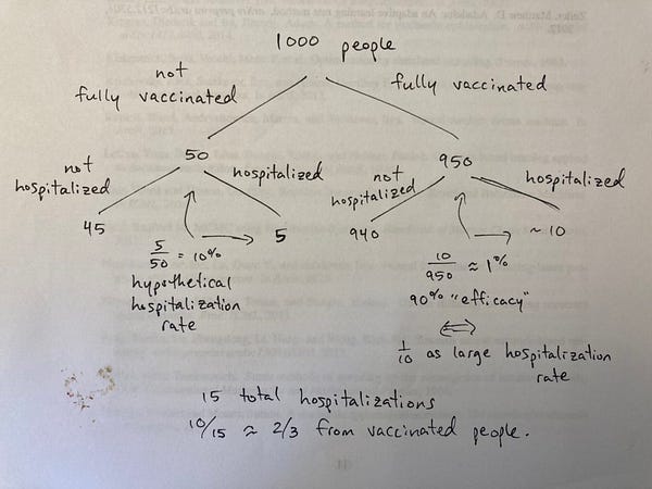
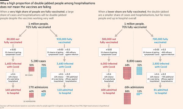
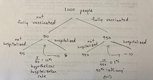
This is most apparent in the freakout-of-the-moment, around the fraction of fully vaccinated people getting seriously ill. This has led to a lot of apocalyptic pronouncements about the awfulness of the Delta variant, etc., but in fact it doesn’t take a lot of analysis to show that highly effective vaccines combined with significant fractions of the population being vaccinated produce exactly the result that seems alarming when you put it in a big font at the top of the page. I’ve had a couple of tweets illustrating this flagged for a while now: this one based off a report from the UK (that turned out even less bad than the initial stories):


and this one that also emphasizes the absolute-number aspect:


You need to actually work things through, not just jump on whatever conclusion seems most intuitive.
Remembering those two things will go a long way toward de-sensationalizing stories that otherwise seem super dramatic. Neither of these involves especially deep analysis or sophisticated technique, just a kind of basic numeracy. Just basic How to Lie With Statistics stuff.
But, of course, in the end, these are just tools, and like everything else in the “critical thinking” arsenal can be employed properly and still lead to different conclusions for different people. Because in the end what matters most in terms of decision making are the individual priorities we bring to the problem: what level of risk do you find acceptable? What sort of costs are you willing to accept? Those are questions you’re not going to answer with math, but unless you’re clear on them, more detailed analysis won’t settle anything.
If this kind of super basic analysis is appealing, here’s a button you can click to have it show up in your email:
If you know somebody else who ought to read this, here’s a different button:
And if you’d like to make fun of me for not knowing advanced stats, the comments will be open.


It's amazing how often I've used the fact that there are ~330 million people in the US during the last year or so.
The first problem is, most people don't think, they react. Your post shows some good examples of how we can each help our friends to think things thru. I really like the branching charts, those make things very clear.
The second problem is, the people bringing us the news do not want to de-sensationalize. In fact they want the opposite. Sensational headlines yield viewers and clicks.